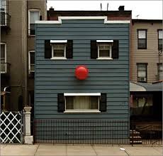
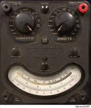
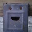
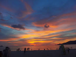
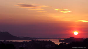
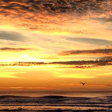
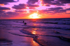
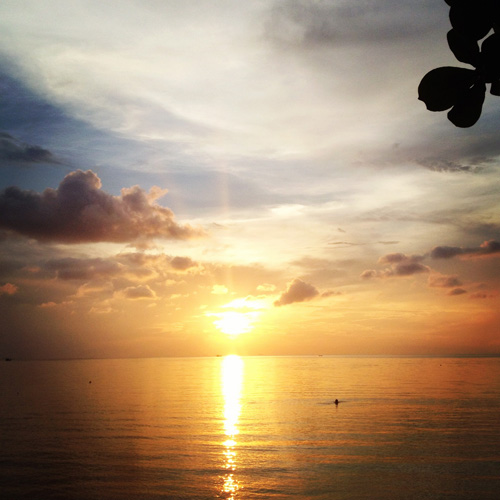
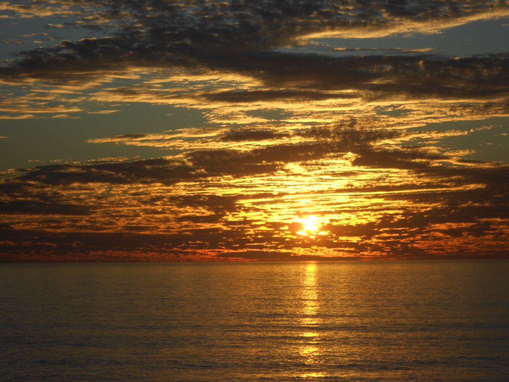
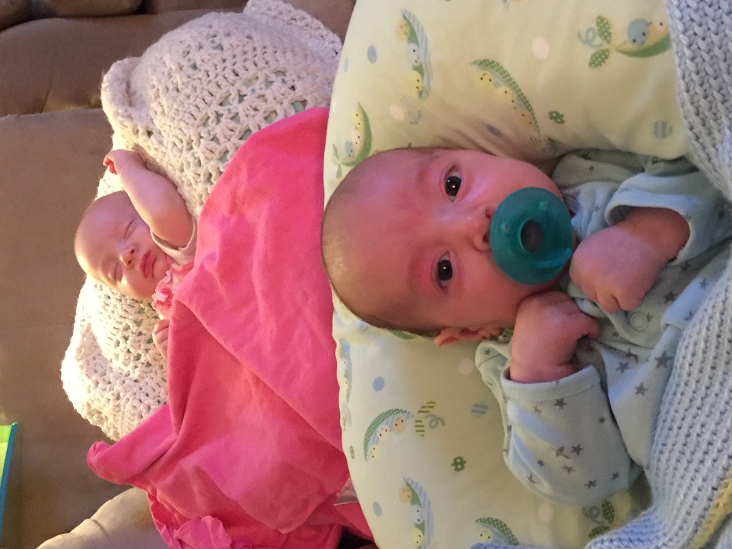
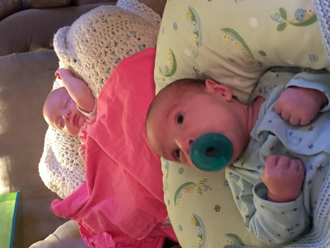
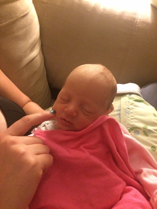
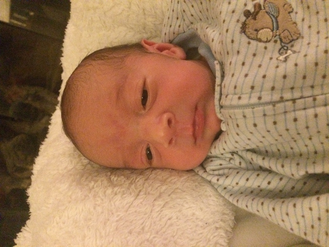
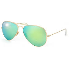
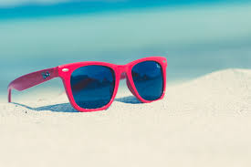
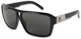
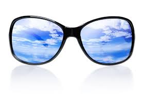
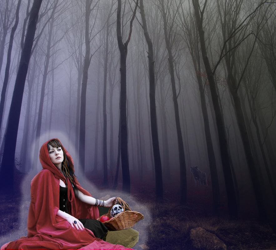
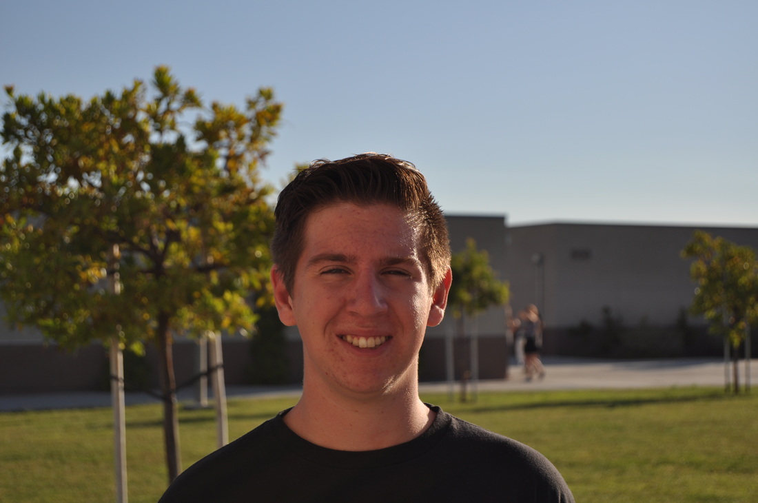
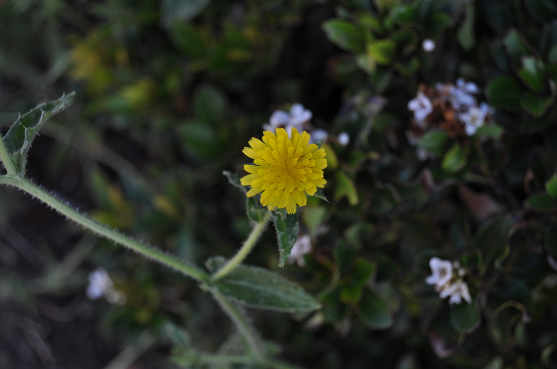
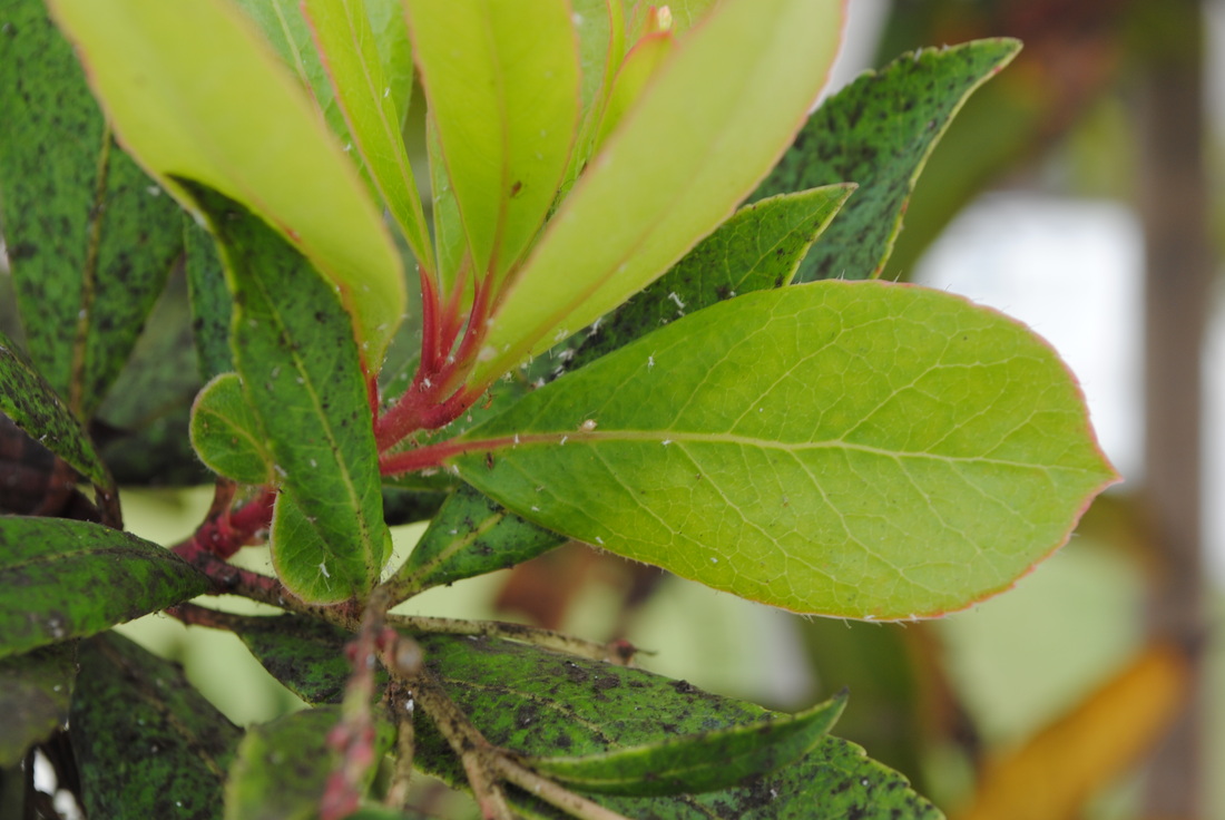
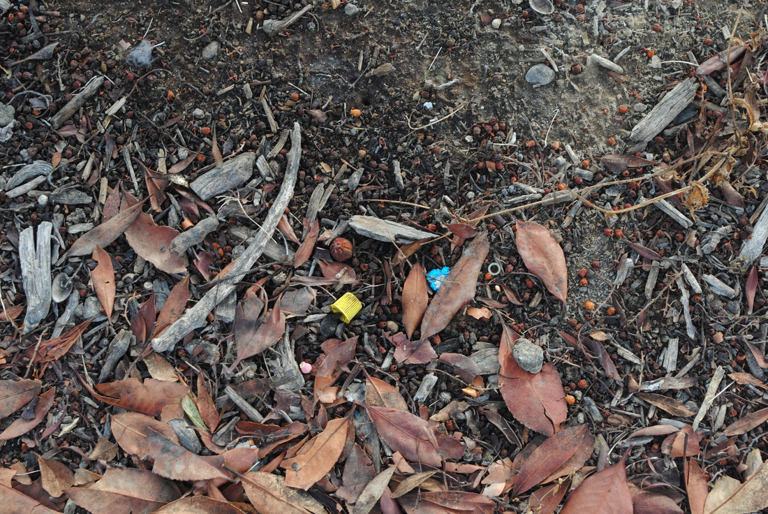
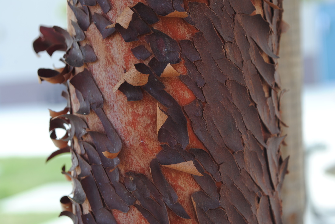
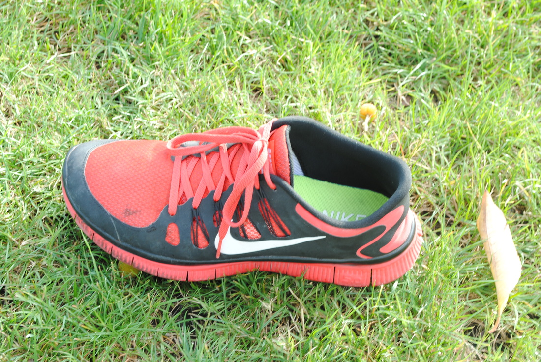
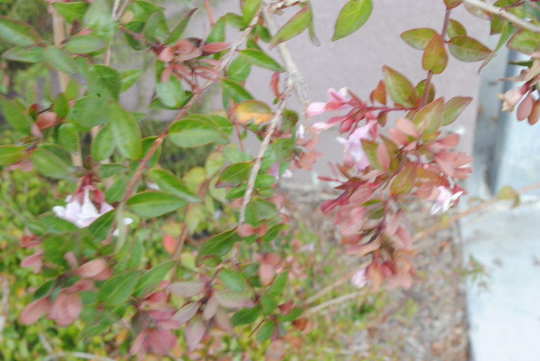
Inspiration Pictures
Book Pictures


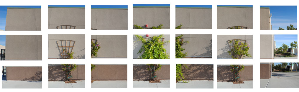
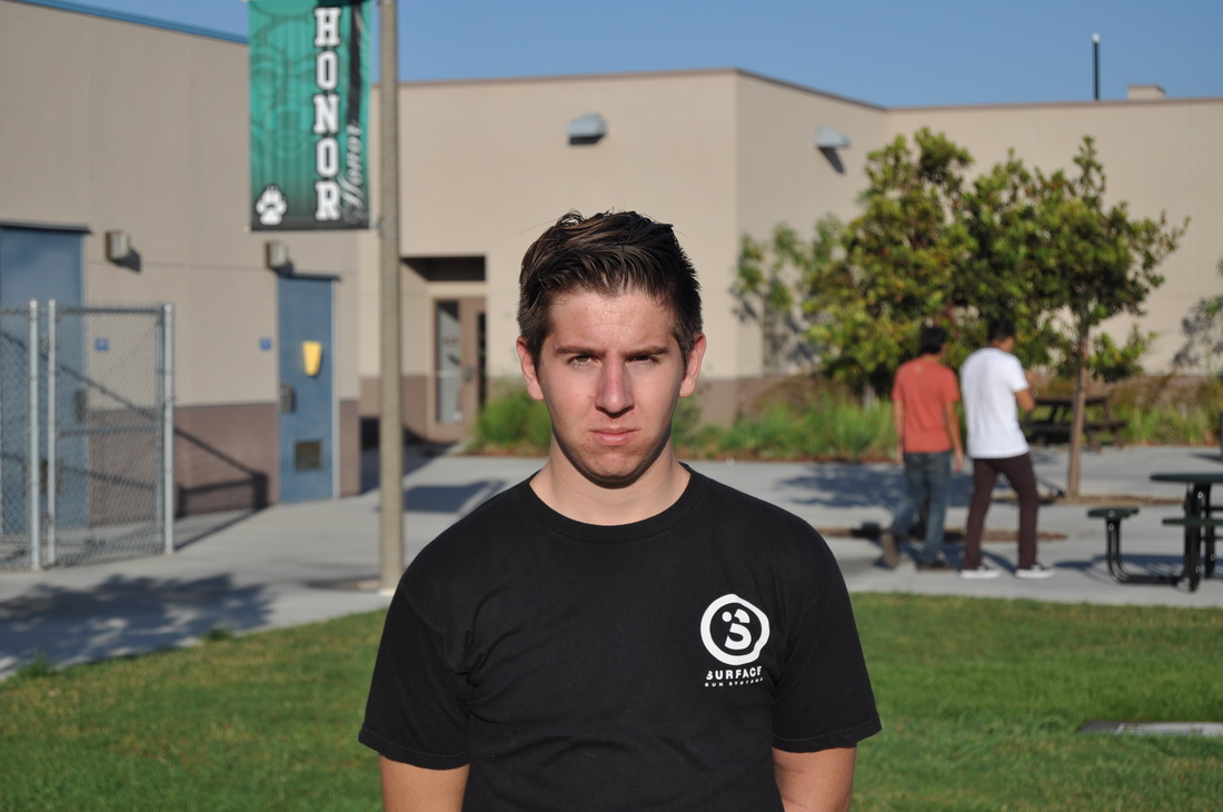
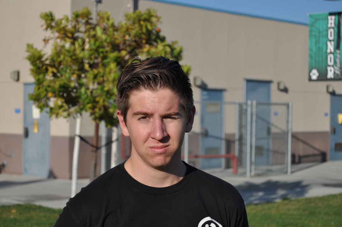
Creating Picture Exactly
|
|
Sketch Note
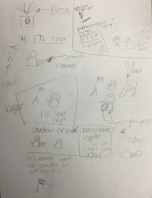
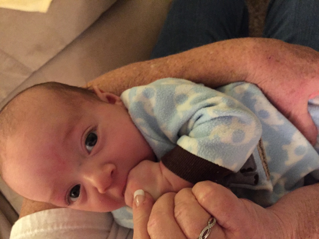
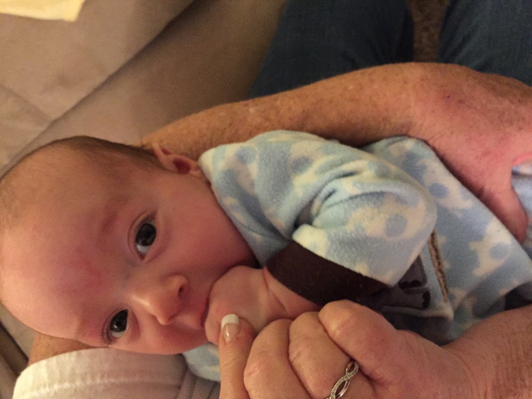
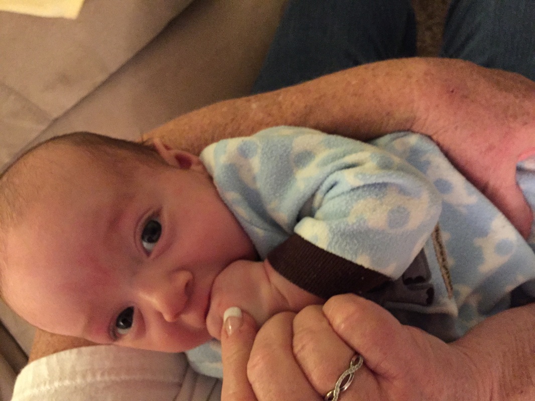
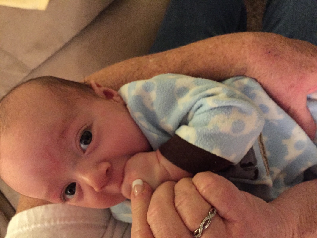
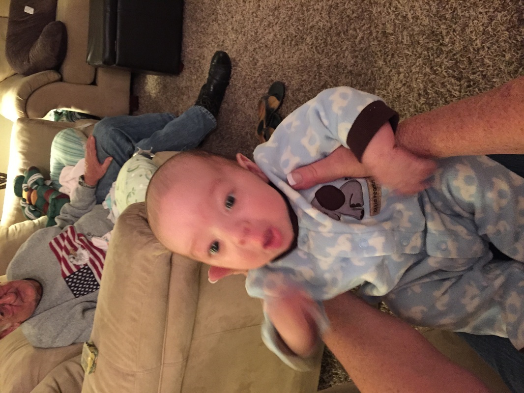
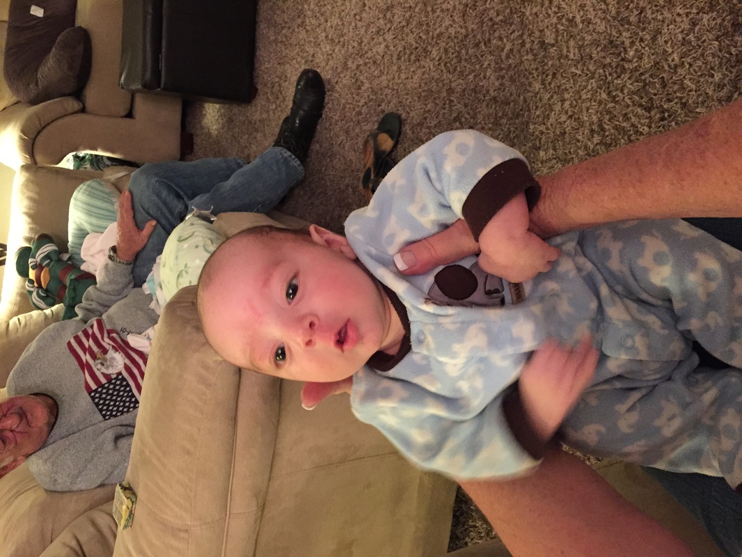
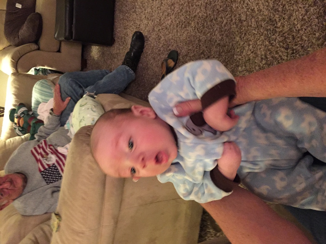
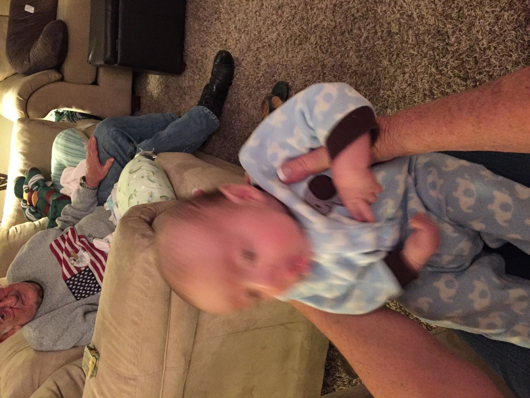
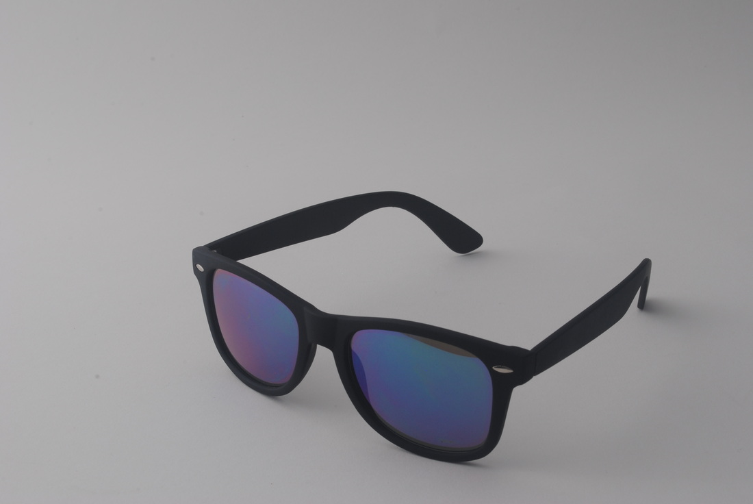
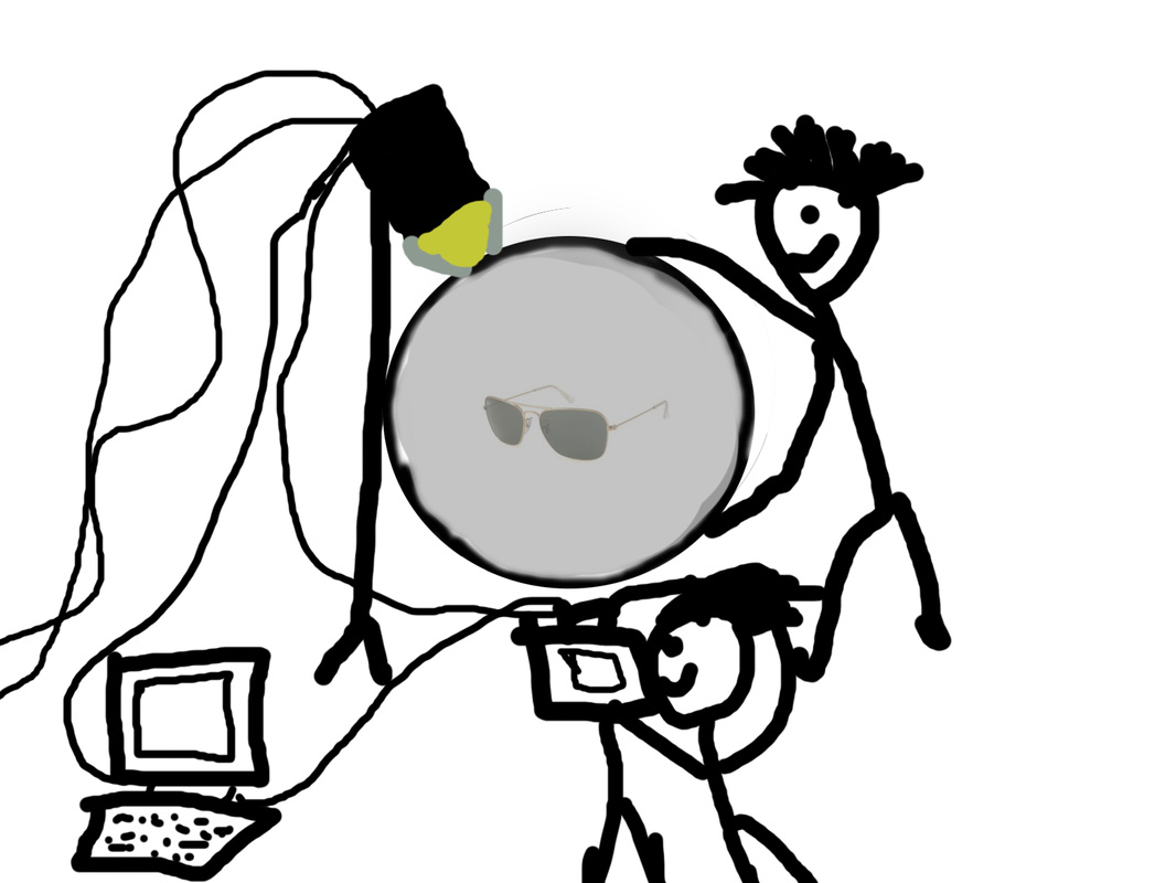
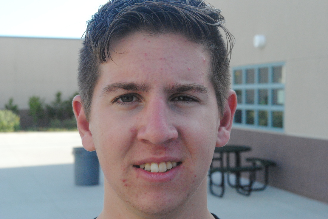
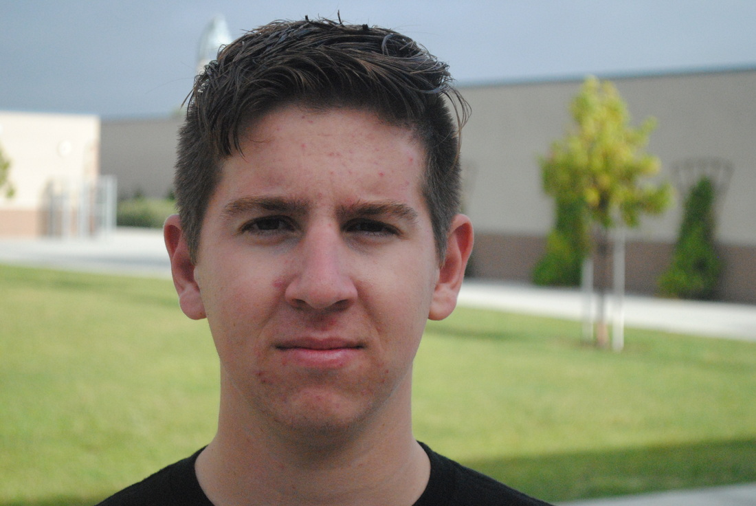
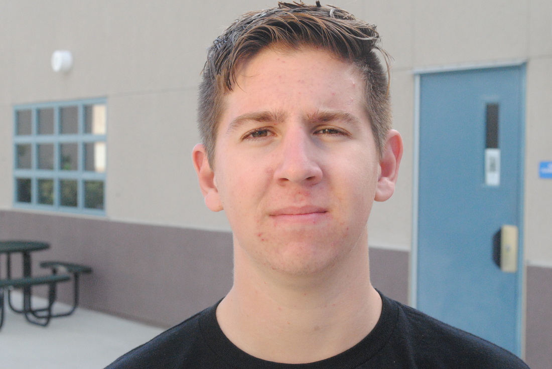
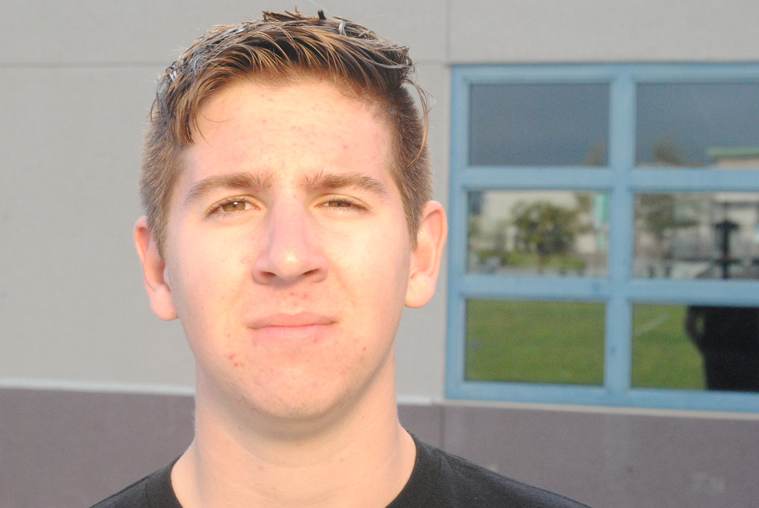
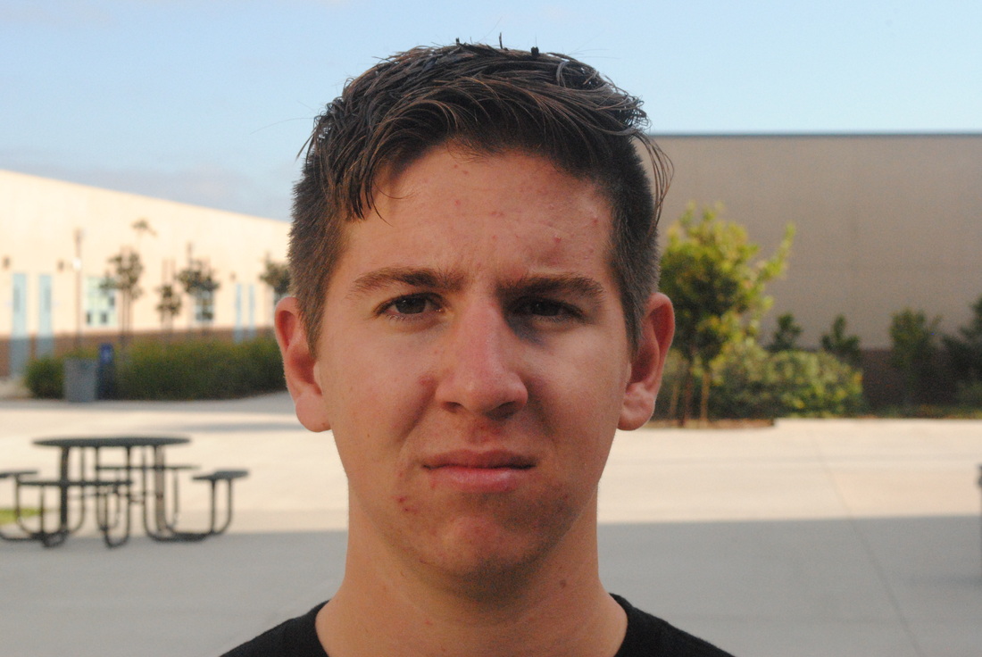
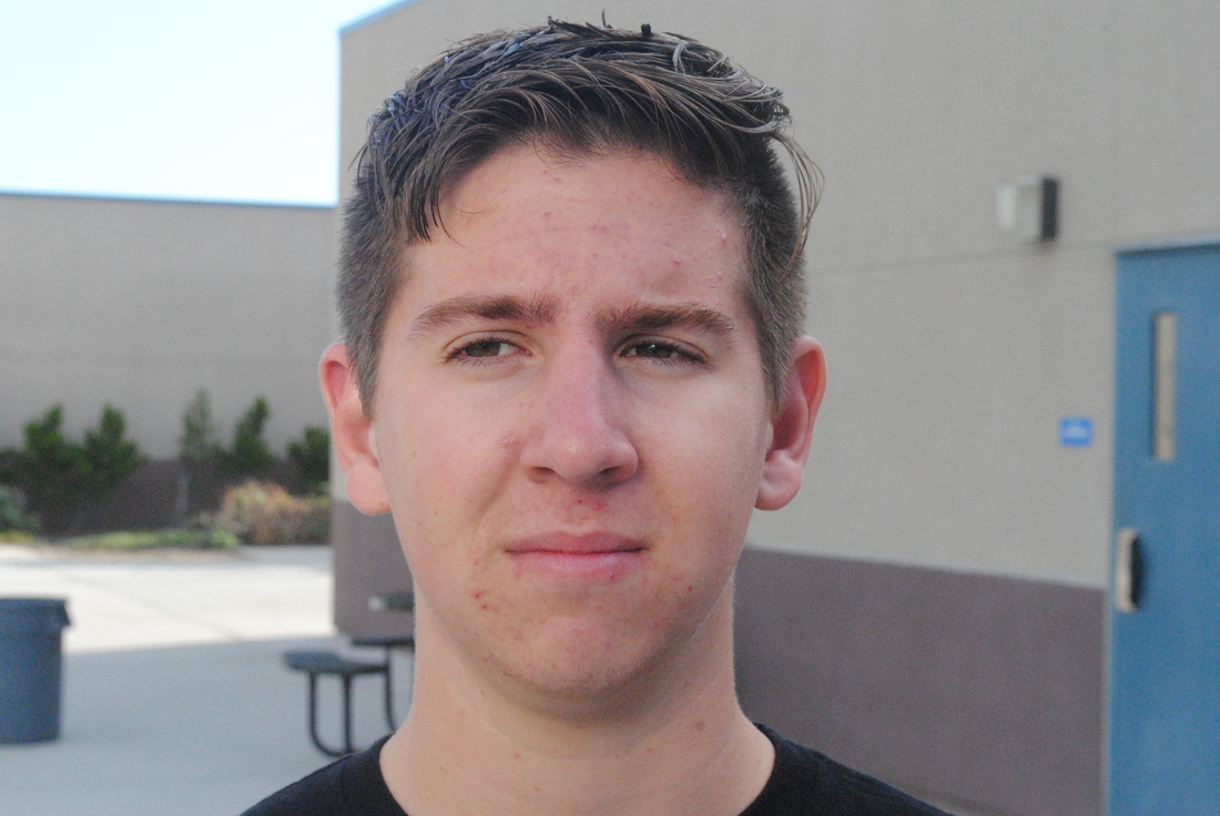
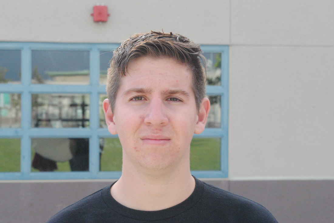
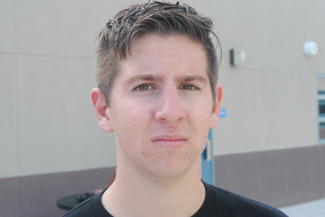
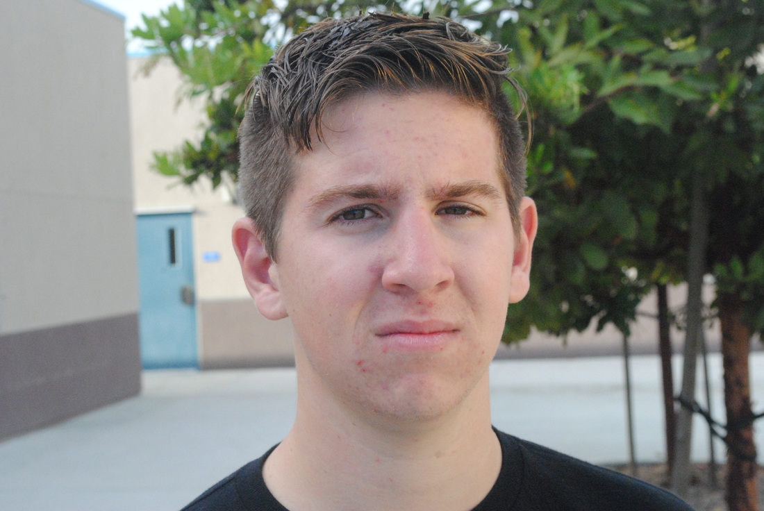
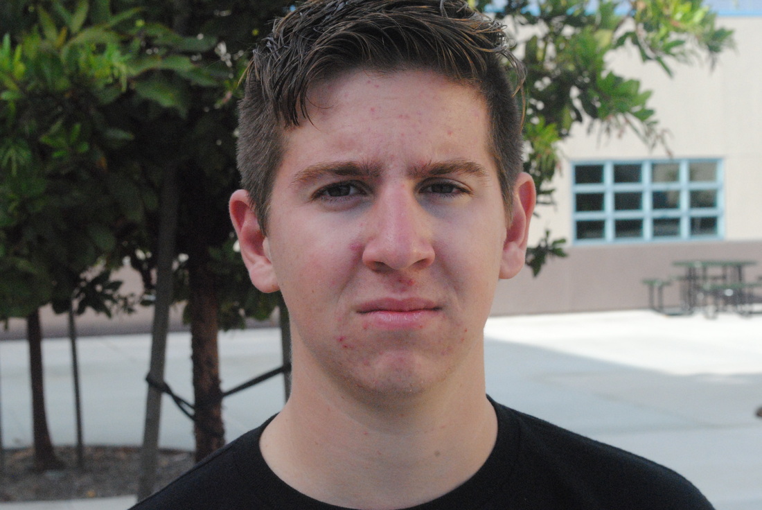
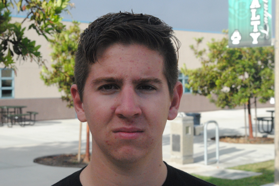
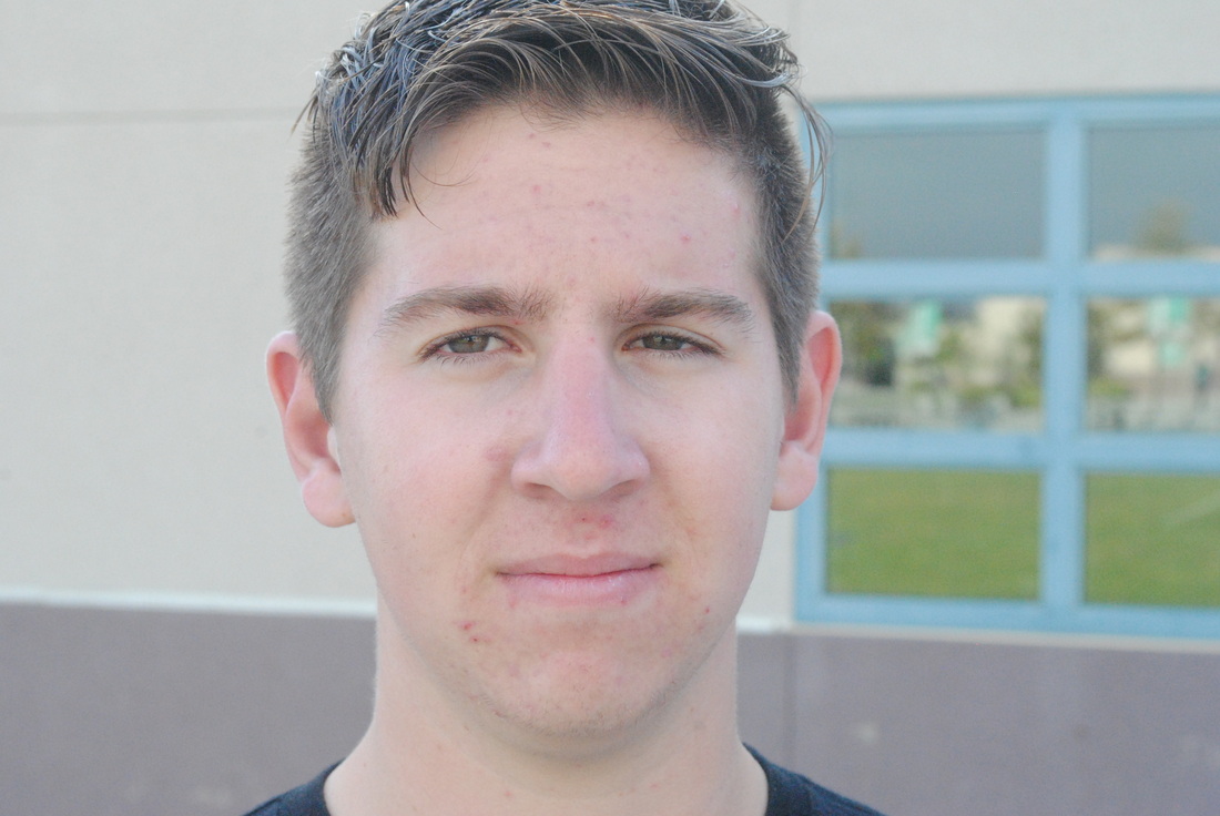
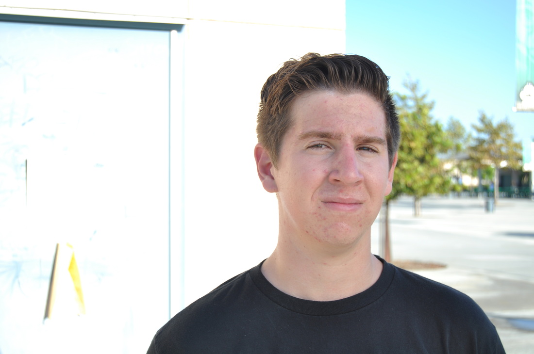
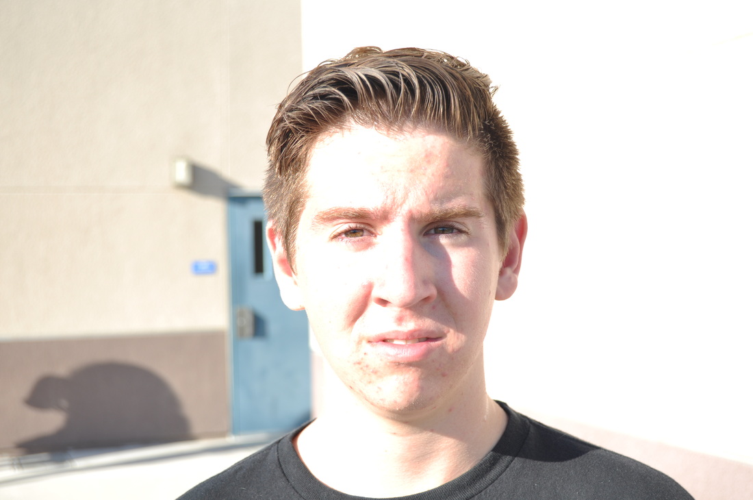
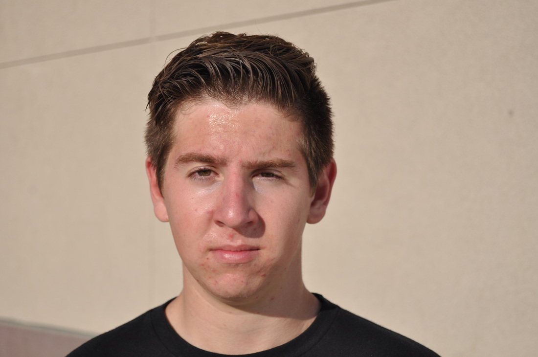
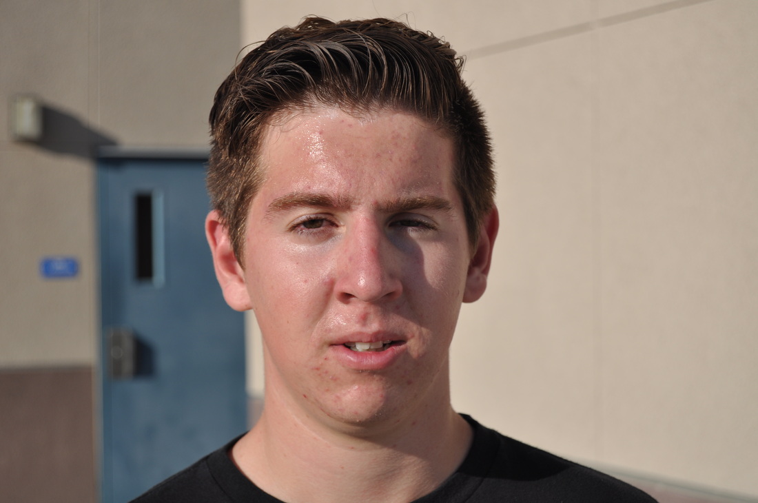
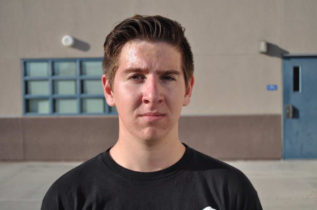
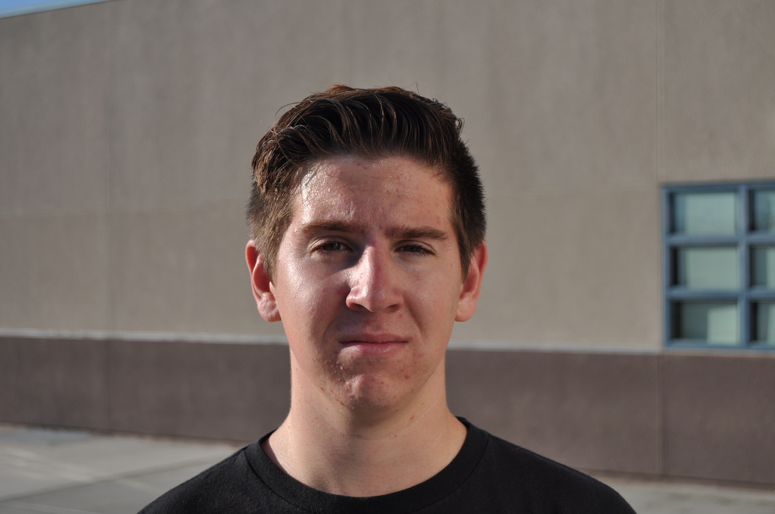
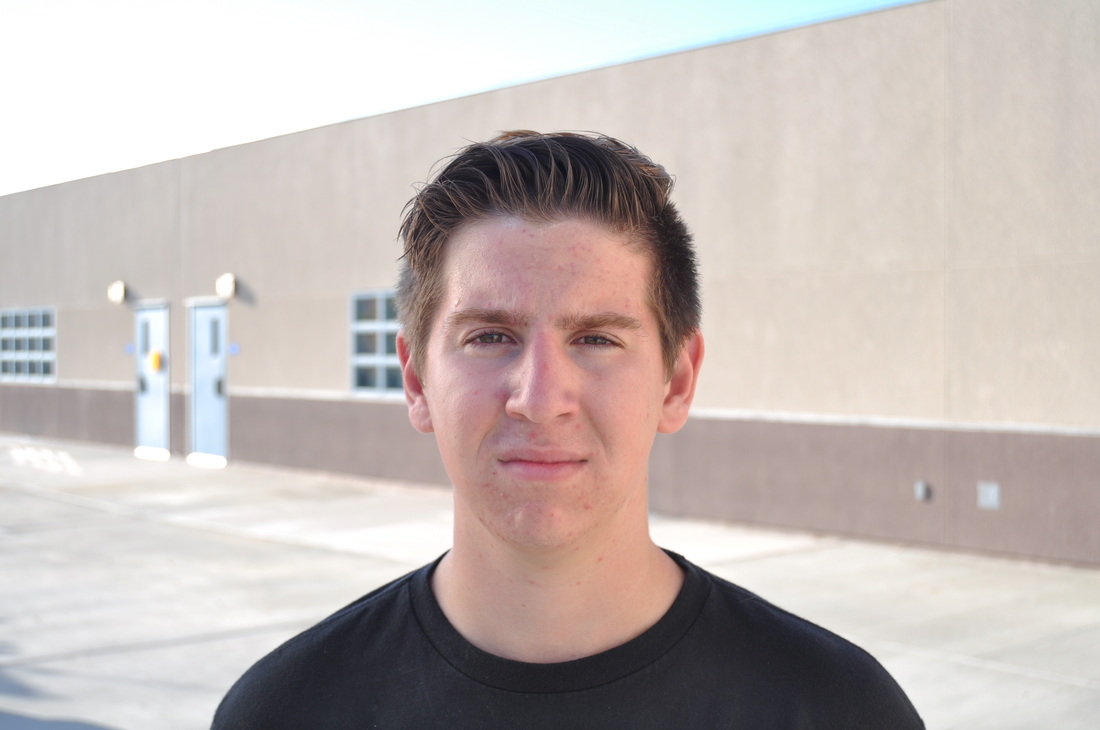
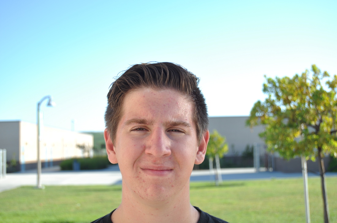
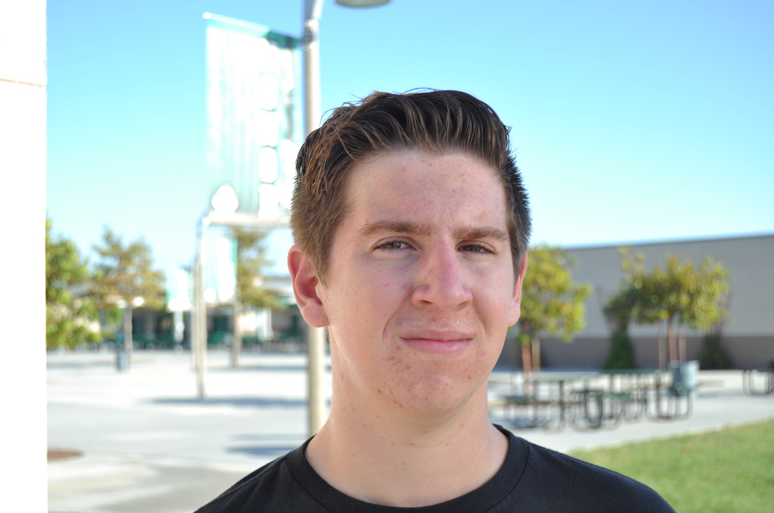
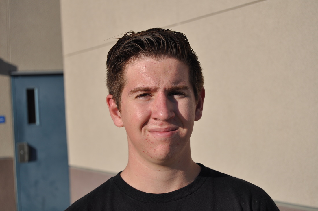
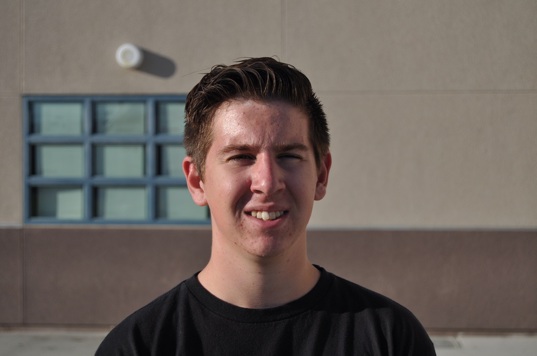
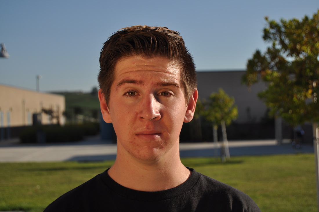
Basic Sunglasses setup
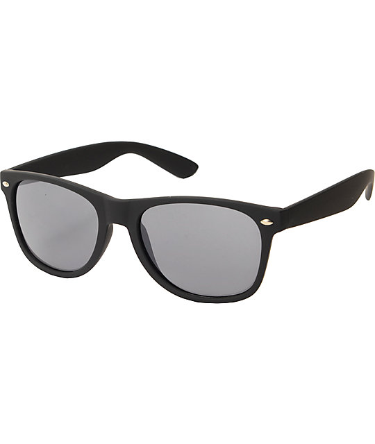
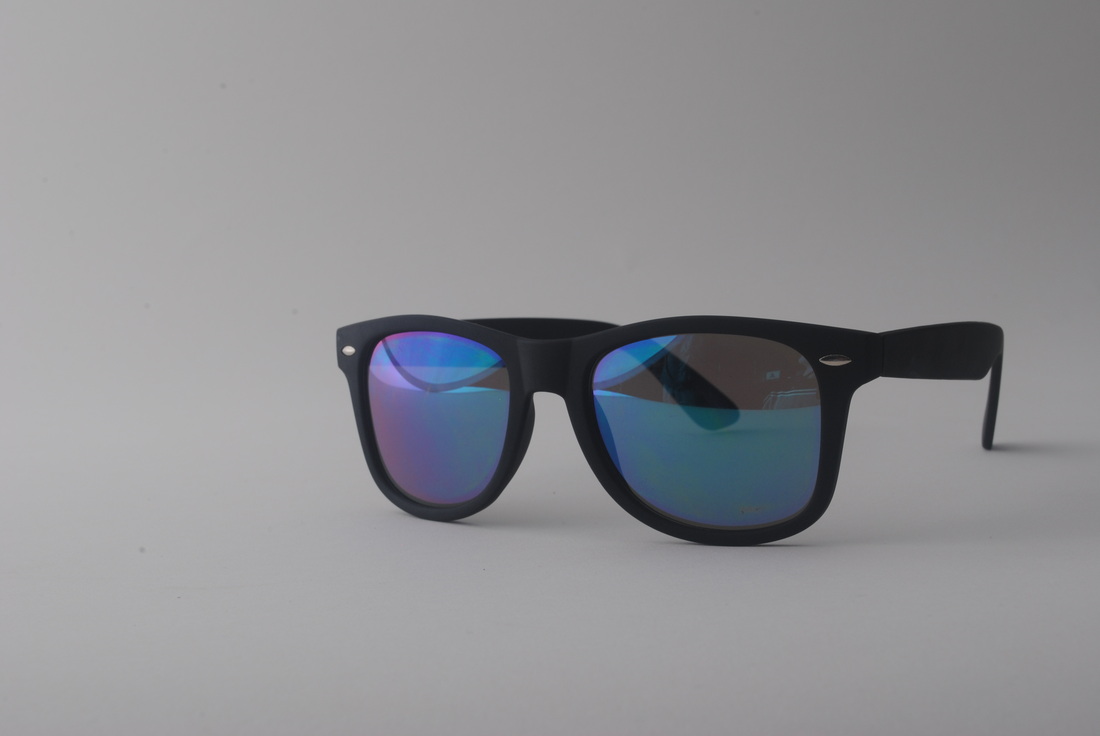
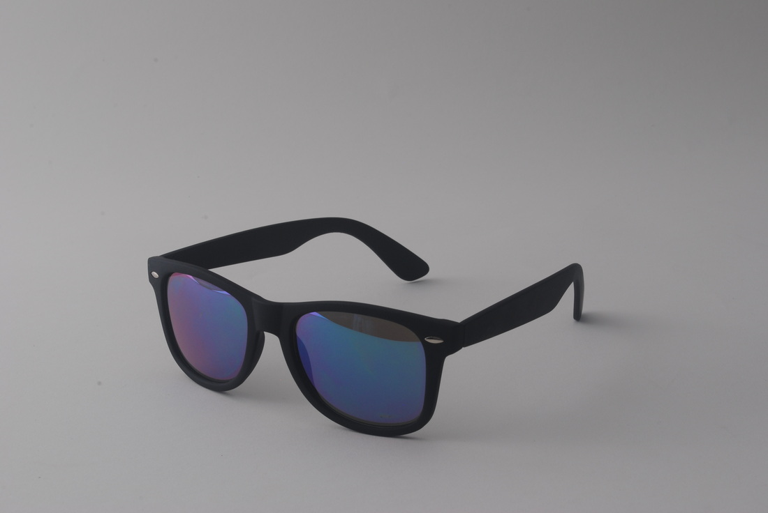
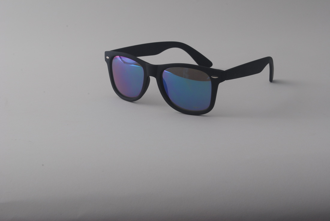
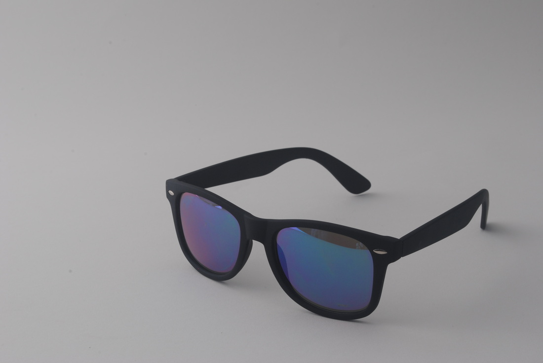
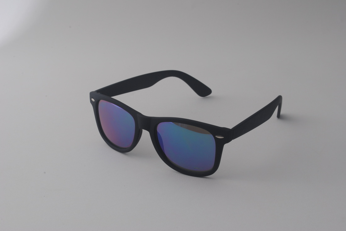
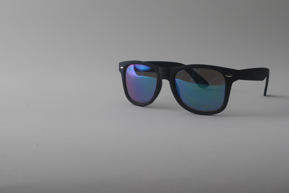
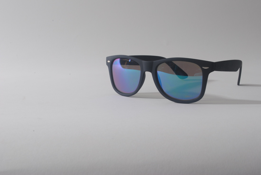
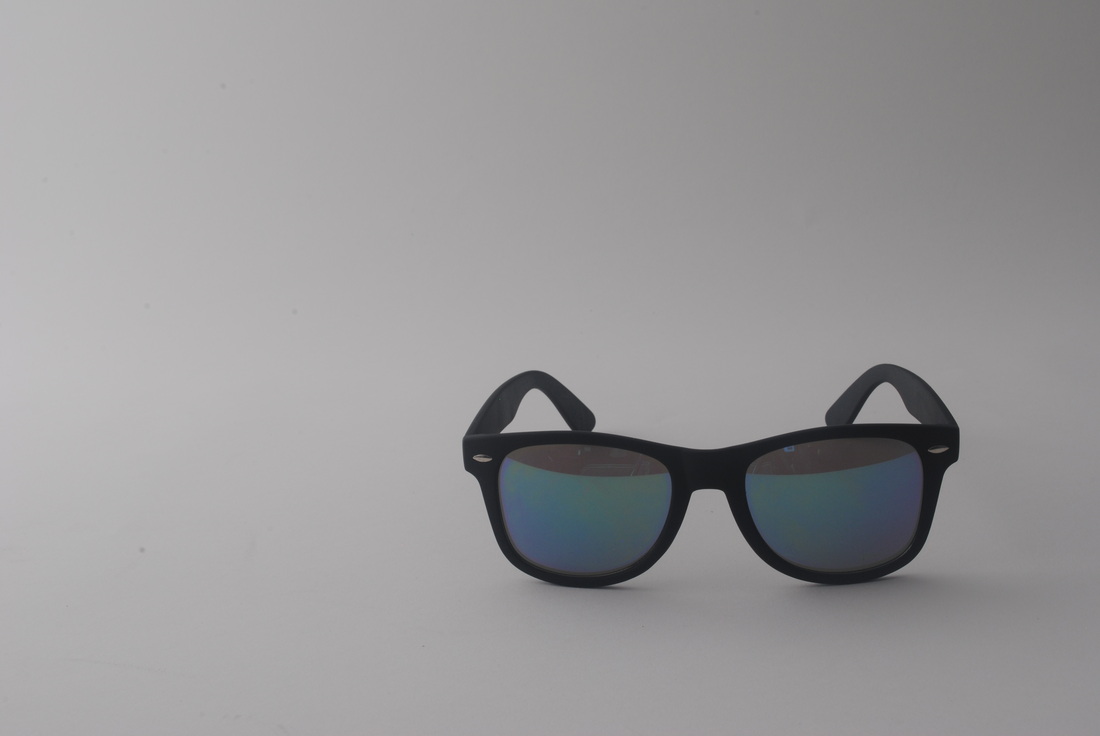
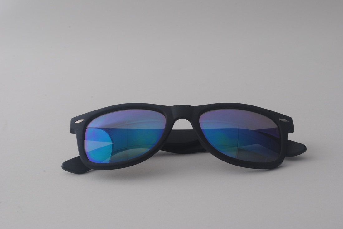
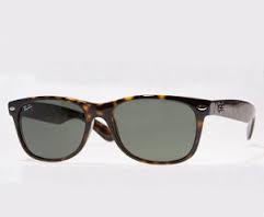
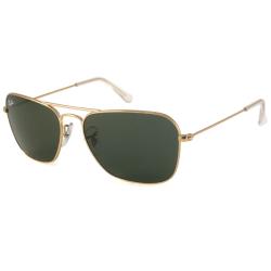
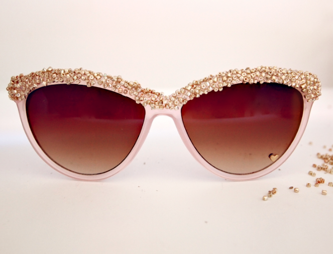
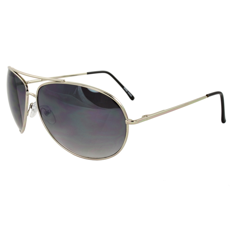
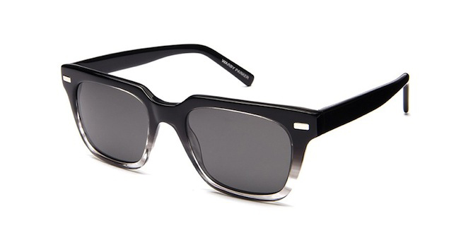
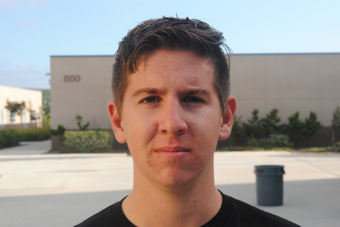
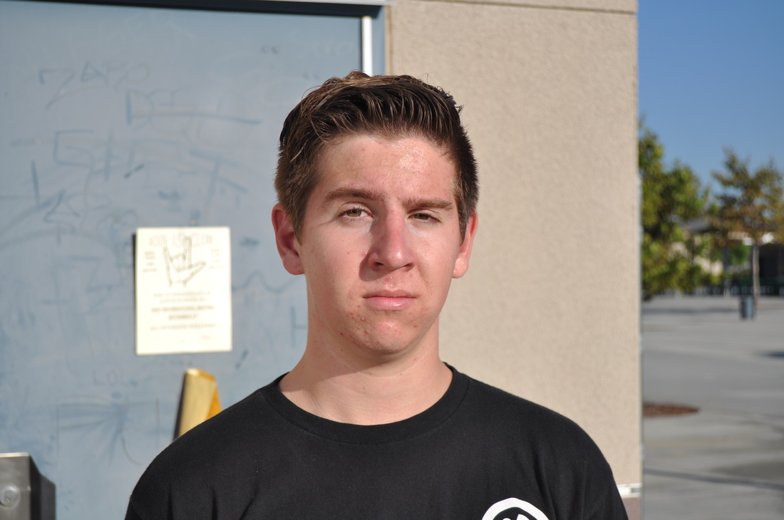
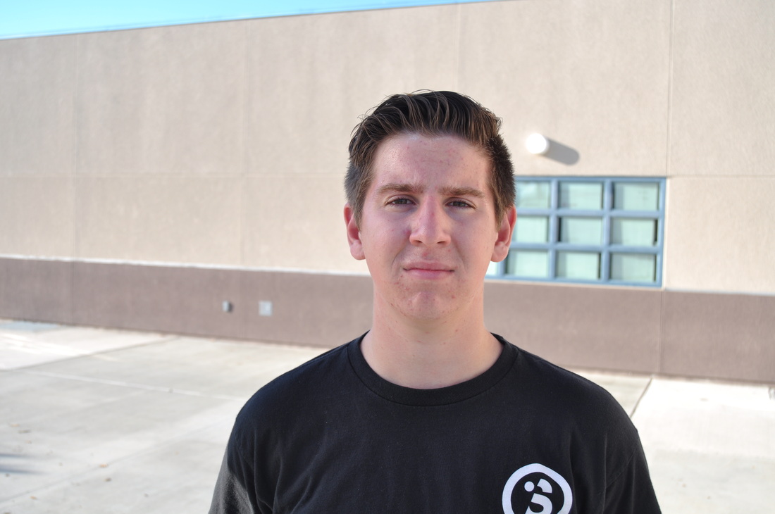
Sunglasses

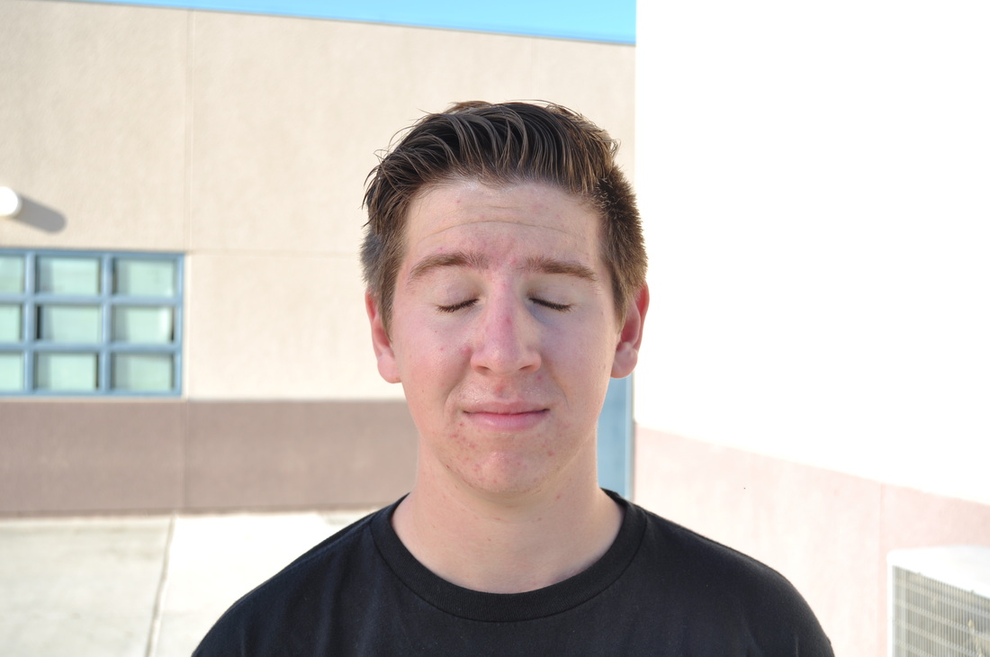
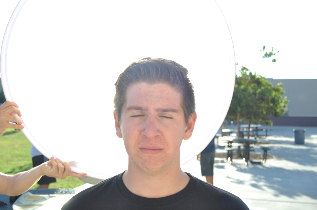
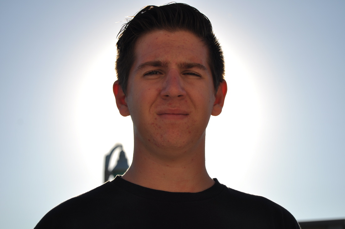
Open Flash
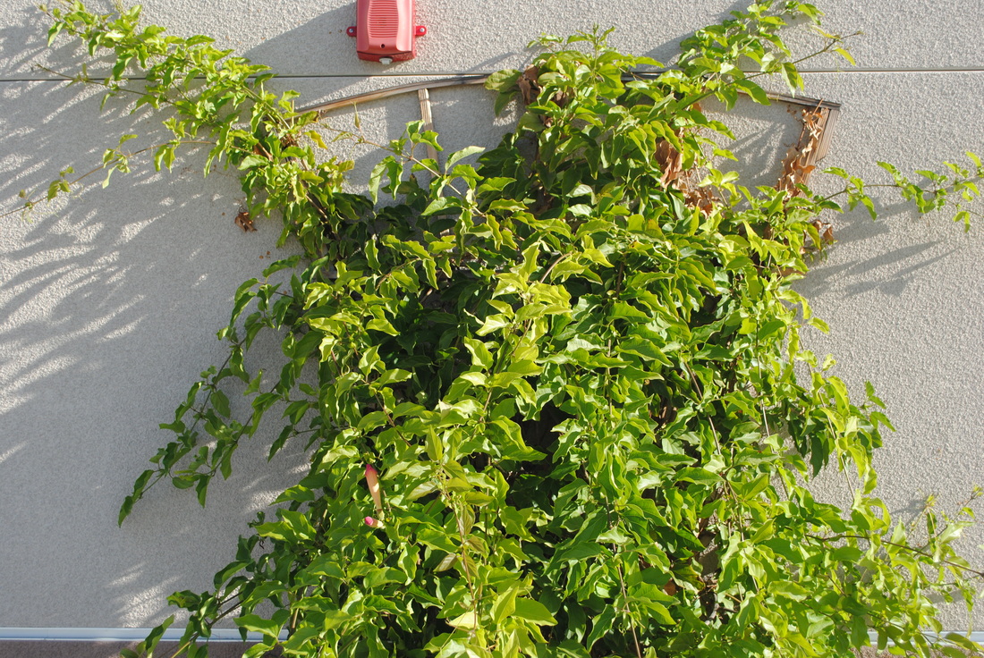
Multiple Exposures in Photoshop

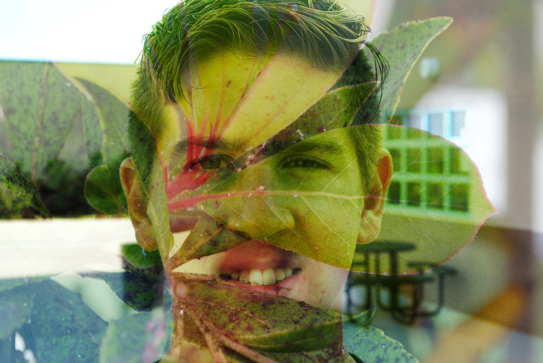
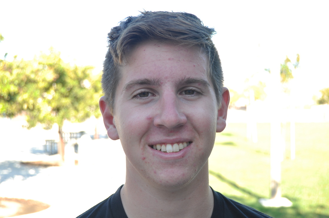
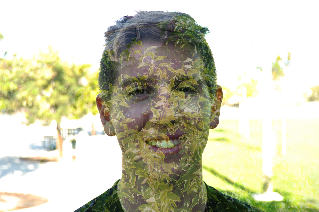
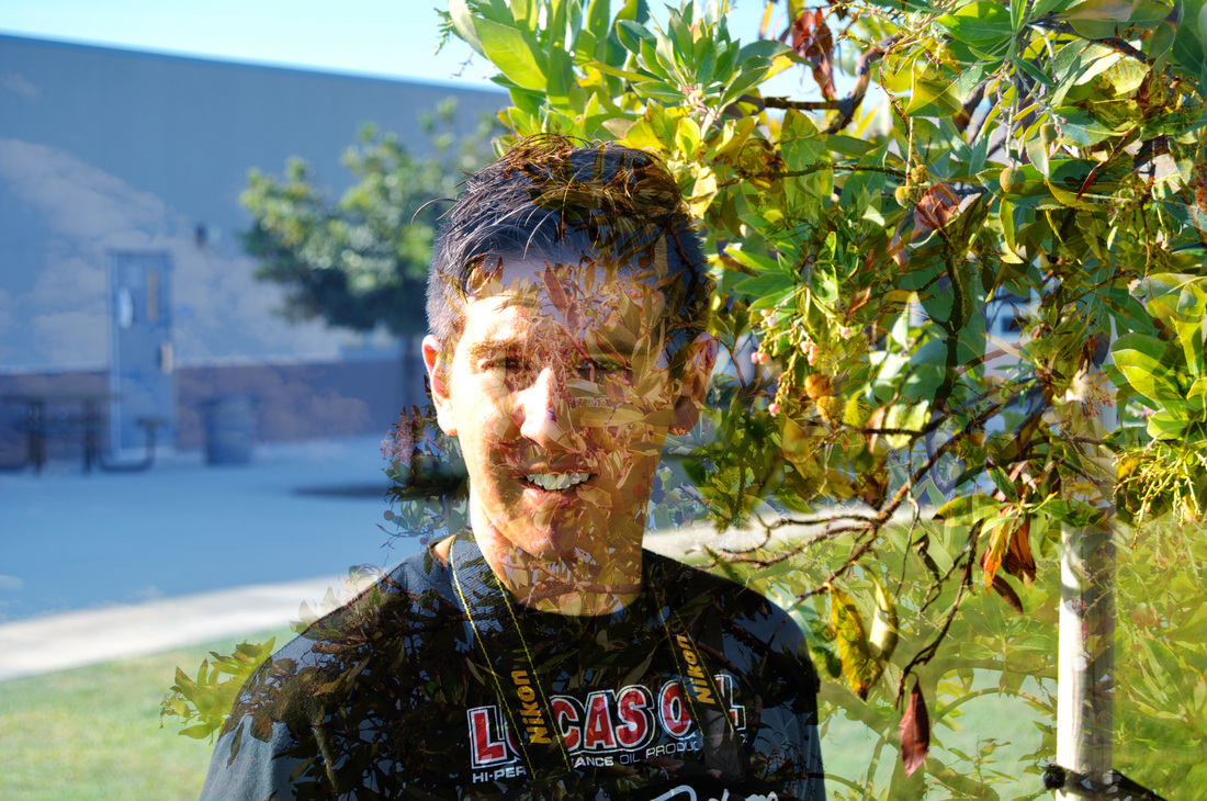
Double Exposure
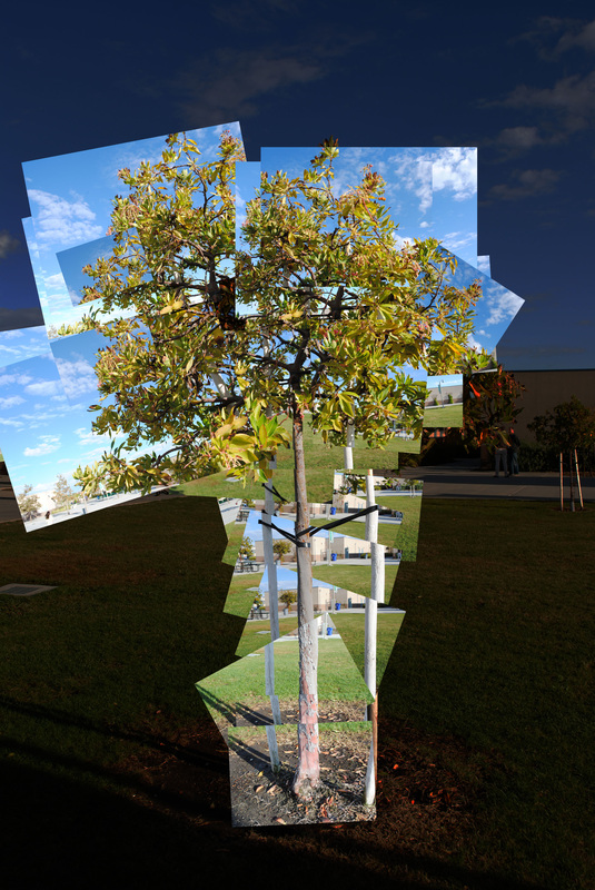
Collage
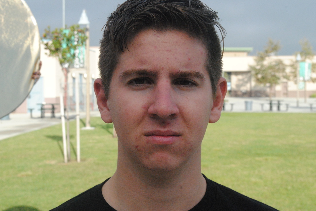
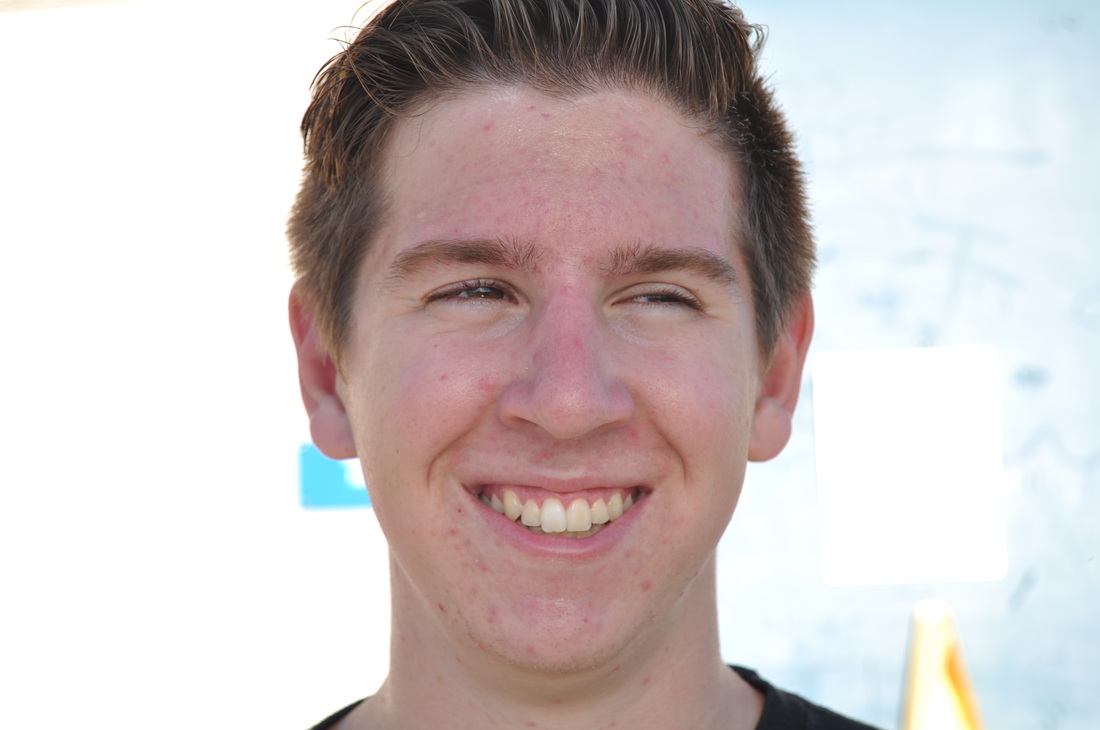
Overcast
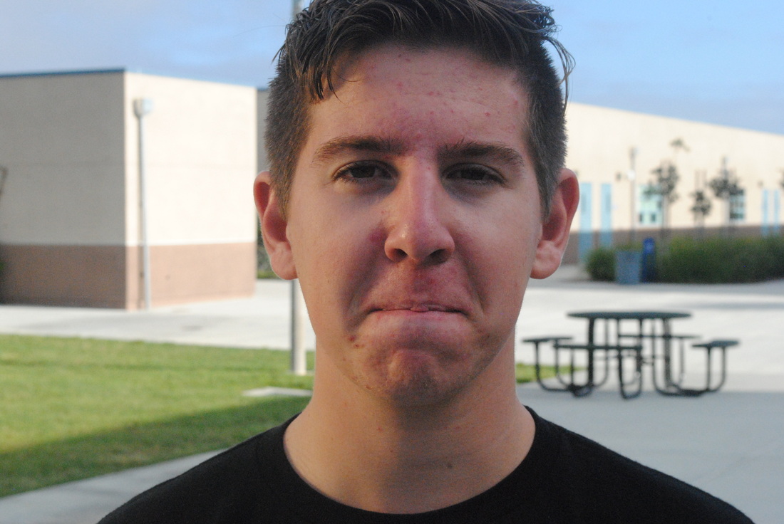
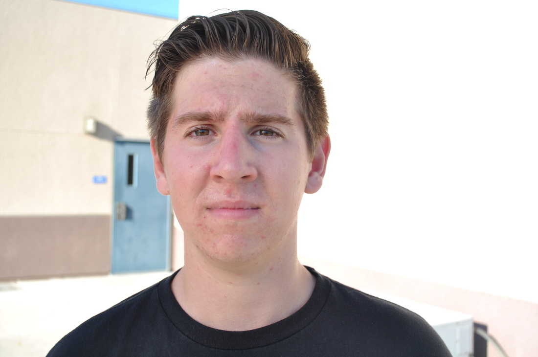
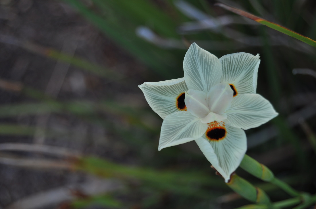
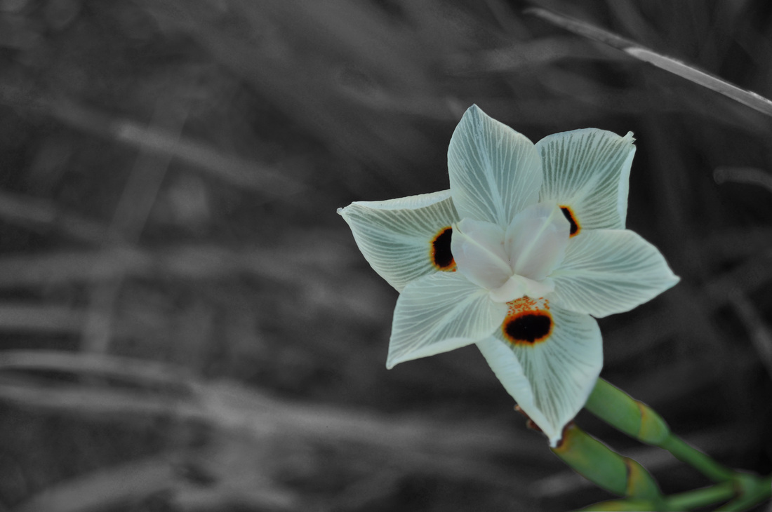
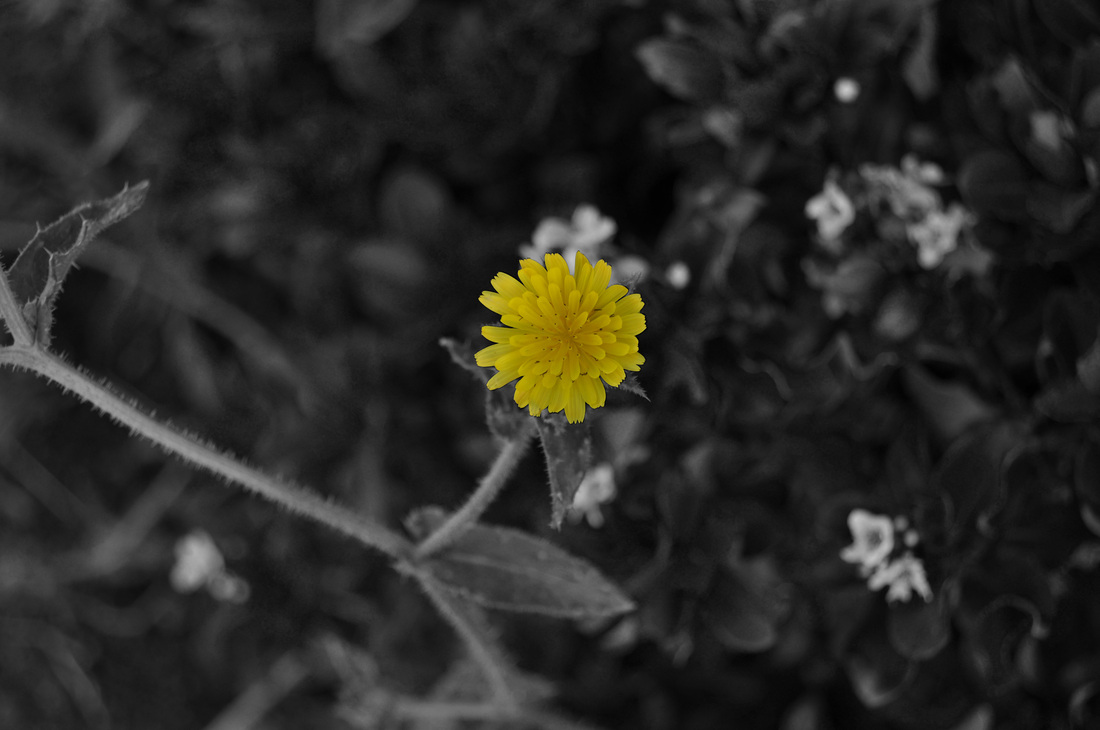
Black

Gold
Silver
White
White
Silver
Diffusion
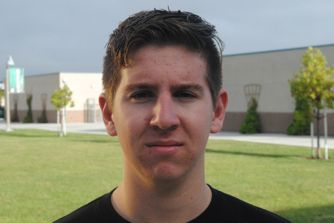
No Filter
Gold
Black

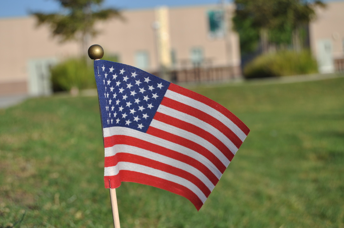
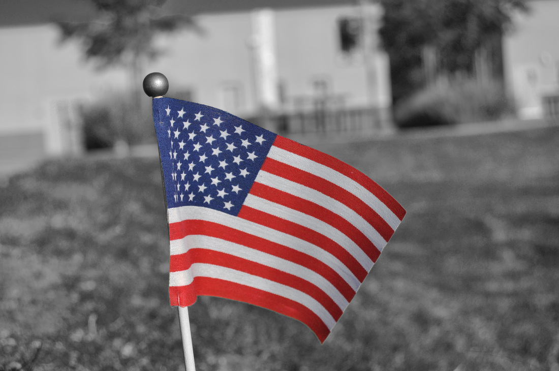
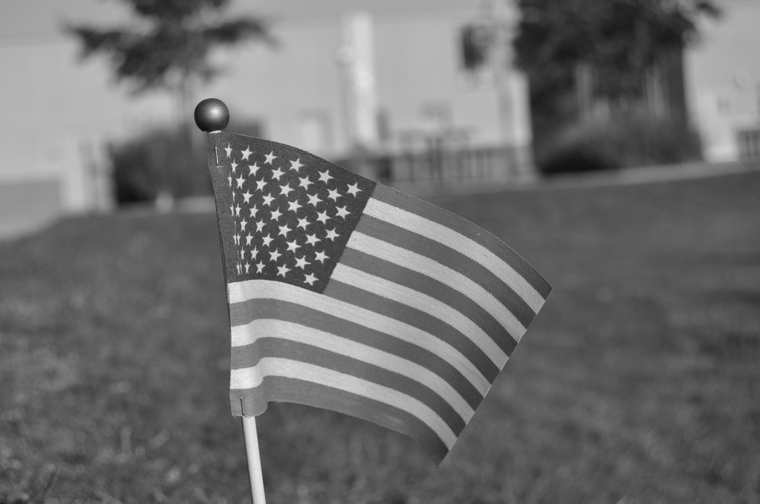
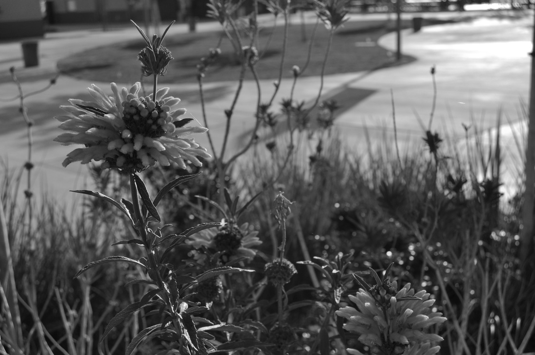
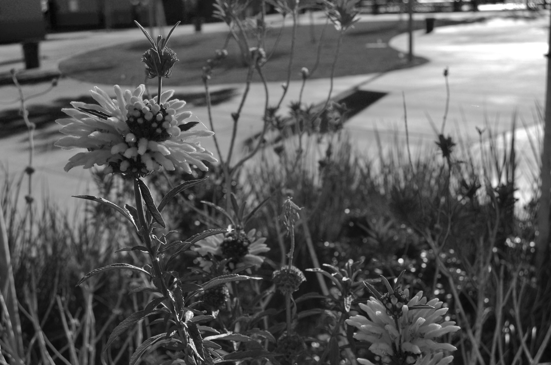
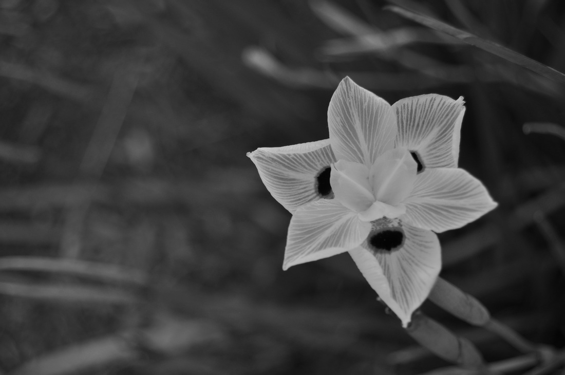
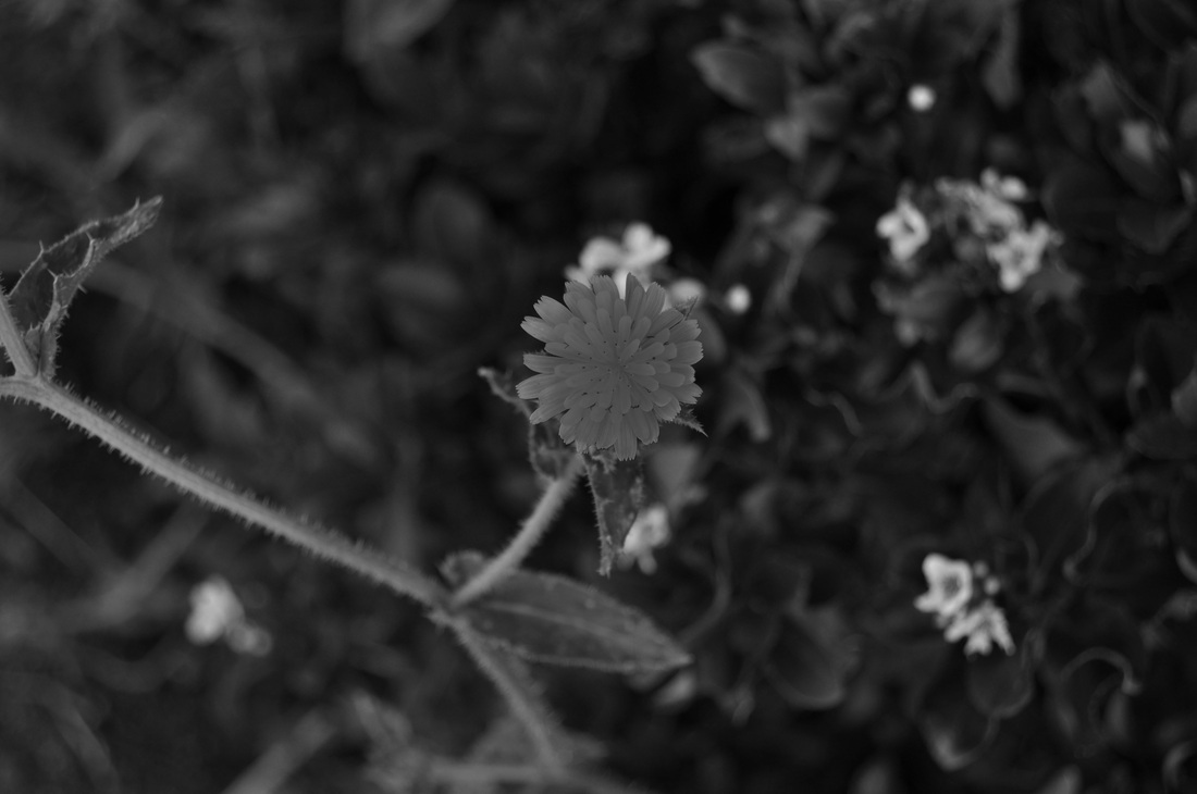
Black and White
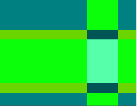
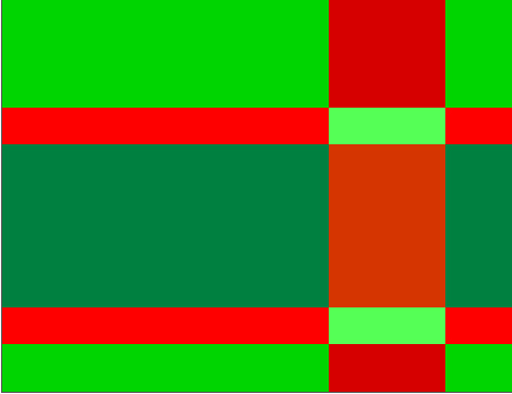
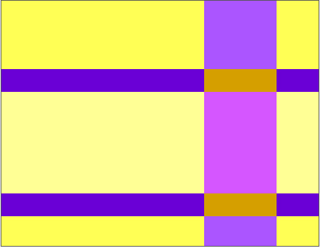
Ittens Contrast
Color Illusions

Questions
To complete this exercise, go to http://www.worqx.com/color/index.htm. Answer the following questions by navigating through the website and looking closely at the illustrations and reading the text.
1. Explain the three ways to describe color.
Name
Saturation
Value/Lightness
2. Compare and contrast subtractive and additive color systems.
Subtractive- it’s used in painting
Additive- It’s used in computer things
3. Define the following terms:
Primary colors – Basic colors that cannot by created by mixing colors
Secondary colors – Obtained by mixing two primary colors together
Tertiary colors – Created by mixing a secondary and primary color together
Complementary colors –Colors that are located on opposite sides
Analogous colors – Colors that are close to each other on the wheel
3. Which colors are warm and which colors are cool?
Warm colors- red yellow orange
Cool colors- blue purple green
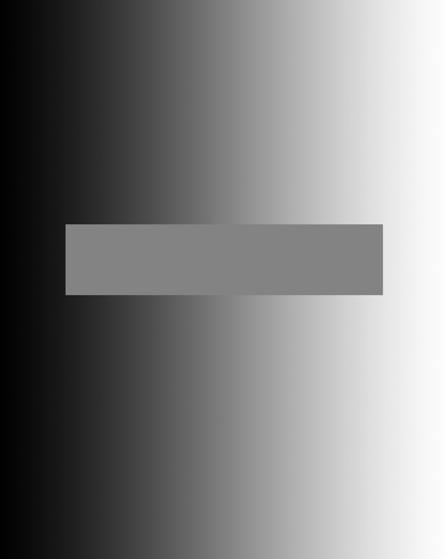
5. How are vibrating boundaries created?
By putting two complimentary colors on top of each other
6. Describe what happened when you did the after burn image. Why does this happen?
After 20 seconds you click on the link and use opposite colors.
7. What are the different relationships between colors?
Monochromatic
Complementary
Split Complementary
Double Complementary
Analogous
Triad
8. When creating text, how much contrast is needed for readability?
At least 80% contrast to provide an easy color combination
9. What are the seven types of contrast?
The contrast of saturation
The contrast of light and dark
The contrast of extension
The contrast of compliments
Simultaneous contrasts
The contrasts of hue
The contrast of hue-primaries
The contrasts of warm and cool
10. How can you create an accent color?
Choose the color that is almost opposite of the dominant colors and put it in small amount
11. Explain the difference between contrast dominance and value dominance.
Contrast dominance- colors are all complements and the saturation changes
Value dominance- Colors mostly analogous but values change
12. Look at the page, Colors Shades and Tints, what are your impressions of the different interpretations of the same drawing. Which is your favorite and why?
They are very different in colors but not that different
13. Look at the page, Colors Studies, what are your impressions of the different interpretations of the same drawing. Which is your favorite and why?
The drawings, although the same colors are all very different because of the different colors.
14 - 16. On the page, Peter Pipers Color Picker, follow the directions to create each of the three exercises: Create a monochromatic or analogous composition, create the illusion of overlapping/transparent hues, and create a composition using one of Itten's contrasts. After each illustration is completed to your satisfaction, follow these steps to save and submitt the images.
1. Explain the three ways to describe color.
Name
Saturation
Value/Lightness
2. Compare and contrast subtractive and additive color systems.
Subtractive- it’s used in painting
Additive- It’s used in computer things
3. Define the following terms:
Primary colors – Basic colors that cannot by created by mixing colors
Secondary colors – Obtained by mixing two primary colors together
Tertiary colors – Created by mixing a secondary and primary color together
Complementary colors –Colors that are located on opposite sides
Analogous colors – Colors that are close to each other on the wheel
3. Which colors are warm and which colors are cool?
Warm colors- red yellow orange
Cool colors- blue purple green
5. How are vibrating boundaries created?
By putting two complimentary colors on top of each other
6. Describe what happened when you did the after burn image. Why does this happen?
After 20 seconds you click on the link and use opposite colors.
7. What are the different relationships between colors?
Monochromatic
Complementary
Split Complementary
Double Complementary
Analogous
Triad
8. When creating text, how much contrast is needed for readability?
At least 80% contrast to provide an easy color combination
9. What are the seven types of contrast?
The contrast of saturation
The contrast of light and dark
The contrast of extension
The contrast of compliments
Simultaneous contrasts
The contrasts of hue
The contrast of hue-primaries
The contrasts of warm and cool
10. How can you create an accent color?
Choose the color that is almost opposite of the dominant colors and put it in small amount
11. Explain the difference between contrast dominance and value dominance.
Contrast dominance- colors are all complements and the saturation changes
Value dominance- Colors mostly analogous but values change
12. Look at the page, Colors Shades and Tints, what are your impressions of the different interpretations of the same drawing. Which is your favorite and why?
They are very different in colors but not that different
13. Look at the page, Colors Studies, what are your impressions of the different interpretations of the same drawing. Which is your favorite and why?
The drawings, although the same colors are all very different because of the different colors.
14 - 16. On the page, Peter Pipers Color Picker, follow the directions to create each of the three exercises: Create a monochromatic or analogous composition, create the illusion of overlapping/transparent hues, and create a composition using one of Itten's contrasts. After each illustration is completed to your satisfaction, follow these steps to save and submitt the images.
J-peg Images
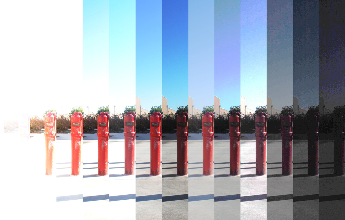
Raw Images
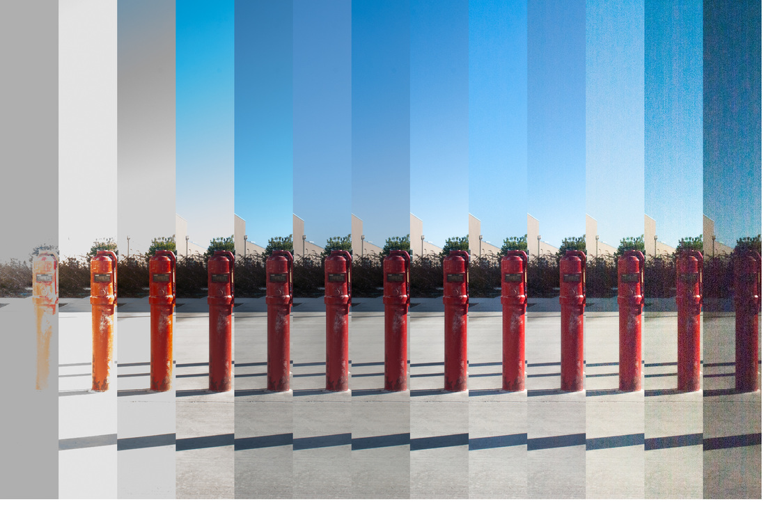
There is a huge difference between the raw and jpeg images I took. I think that the raw images have a better look to them. Jpeg images don't look as clear as the raw images. All the jpeg images don't look right. Raw has a look to it as if you were actually looking at the place itself. The Raw and jpeg images have a different color as the exposures get higher and lower. The raw file size is bigger than the jpeg image, I think it is because the images look better.
